Medical supply company website

Corporate & E-commerce website re-design

Medical supply company website

Recharge health is a Norwegian company producing a recovery device using targeted red light therapy. We were in charge of redesigning its old website along with the responsive version and developing. Our aim was to redesign the website that clearly shows the information Recharge wants to convey to customers while keeping it modern and trendy.


Recharge image1

Team
1 UX/UI Director & Project Manager
1 Graphic Designer
1 Web Designer
1 Front-End Developer
1 Worpress Developer
Methodology
UX/UI Workshop
Waterfall methodology
Tools
Lark
TeamWork
Adobe Xd
Adobe Illustrator
Adobe Photoshop
Technologies
JavaScript, PHP, WordPress, WooCommerce, mySQL, Bootstrap, HTML5, CSS
Timeframe
2 months

The challenges

Overall, the biggest challenge was that there was no separate purchase page on Recharge’s previous website. In addition, sub-pages that provide corporate and product information had problems with user experience regarding conveying information to users. There were several key challenges that we needed to solve:

  1. As mentioned above, Recharge sold its products and communicated with customers through a cloud funding platform called “indiegogo” in the absence of a page that sells its own products. This structure could cause inconvenience to customers, so creating a sales page on its own was the biggest challenge.
  2. Due to the nonconformity of the layout of the previous homepage, the clarity and readability of the information were poor.
  3. The overall design of the previous website was monotonous and outdated. In addition, it was difficult to feel the professionalism that the brand was pursuing throughout the whole pages.
  4. The old website wasn’t adapting to any device and screen size quickly and properly. Bringing the user the most dynamic experience possible at any device was a challenge.
Recharge img1

The solutions

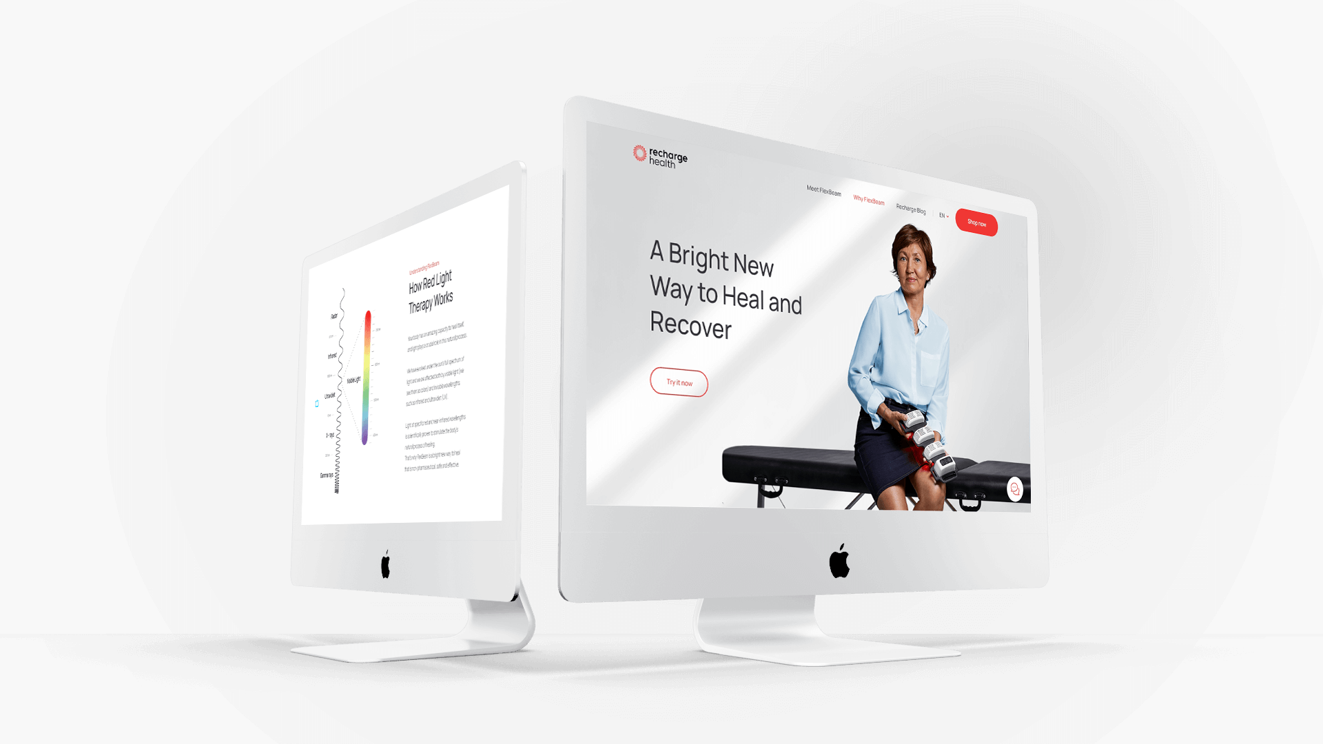
First of all, by adding a product detail page, customers can purchase products directly from the company’s own website. By continuing to expose the “Shop Now” button to the menu, customers can move from any page to the purchase page. In addition, through the product detail page, the “Extra Accessories” are designed to be purchased together optionally as customers wish. The brief of product information, customer reviews, and FAQ sections have been added to address customers’ product-related questions.

Secondly, considering the expertise and complexity of the product, we enhanced pages “Meet Flexbeam” and “Why Flexbeam” by adding graphics, text and interesting interactions to help users get the information they needed before deciding to buy.

Thirdly, It needed a design that could deliver stability, expertise and reliability to customers. The overall layout was expressed in an editorial design format adopted by many high-end brands to express simplicity and modernity. The editorial design may seem monotonous, but in order to avoid this, we sometimes tried to avoid such shortcomings through aligning each layout differently.

Lastly, by creating responsive design of every page, we have made it possible for users to access the website seamlessly through various devices. Considering the limited screen size of portable devices, design elements were rearranged to suit the situation.

Recharge img2

The summary of project

To deliver a transparent, professional, and user-centered system, we went through a renewal of UI/UX design progress.This project sought to provide a good experience and value that meet customer needs and deliver a brand identity through an improvement of UI/UX design.


Recharge 4

Have a project in mind?
Let's start your project today

Contact Us
Have a project in mind?
Let's start your project today